Short of running through the streets of Rome dressed in a toga to celebrate the middle of March, we thought it best to save the airfare, stay on track and celebrate the anticipation of spring by sharing some color (sketches) for the WNBJM backglass art and give you a sense of some of the over-thinking that goes on in my brain.
Back in the beginning of January, I had worked out a schedule for my own progress on the art package for the game and it seems no matter how many times I put together a schedule, and no matter how "realistic" I think I make that schedule, time keeps on slippin'(slippin', slippin') into the future. Oh well, we are here, this is now, and tomorrow is just another step in the journey.
So here's a rerun of the black and white sketch (dyed green to honor St. Patrick and the green beer he drank) to help visualize the process of working into color. Keep in mind that this first color sketch is primarily to set the tone and work through ideas for the entire art package. This first attempt at adding color is still based on the rough pencil sketch so refining the drawing is a different step in the process.

Just for fun, I started by adding some flesh tones to Melony, took a picture of my screen, and sent it to Dennis to prove that I was making progress on the schedule as planned. This is not normally something to get excited about but I thought that since we have more people looking over our shoulders on this project it would be fun to chronicle even the smallest amount of progress.

During this phase of development I had to start thinking about the printing techniques that we might be using for the backglass. Earlier I mentioned that we had been talking to ourselves and to a lot of people about the value of this project and the expectations of the quality of the finished piece. Being that we're basing the project on a game from the late '50's, my original direction for the backglass was to print it "old school"...silk-screened line art/spot-color similar to most backglass art prior to the late 1970's. However, this technique is a bit outside of my comfort zone. (Cue the flashback music and soft-focus swirly background.)

When I started working in the pinball business in 1978 at Bally, line-art backglasses were being phased out in favor of a printing method that is visually more familiar to most people. Back then, record albums were still 12 x 12 inches and had become an art form unto themselves. But most record albums were printed on a lithograph press using an industry standard printing method called "4-color process".
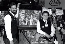
(Side note: Pictured from left to right starting in the back row - John Reckas, Mary Beth Bush, Kevin O'Connor, Paul Faris, Margaret Hudson, Greg Freres [with excess hair]...Bally during the holidays, 1978.)
Without going overboard in explanation, a photograph or illustration is converted into a series of overlapping dot patterns comprised of only the 4 colors used on the press - Cyan, Magenta, Yellow and Black (aka CMYK).

This method is used in all color printing of magazines, books, newspapers, etc. It creates the illusion of "continuous tone" images by fooling the eye into seeing more color than is actually printed on the paper. (Please don't take notes, there's no quiz at the end of the post.)
Paul Faris was the art director at Bally when I was hired and was responsible for the change from the traditional silk-screened look of the backglass to the 4-color process printing technique that allowed the artists more flexibility in the way they approached the subject matter. For the first time soft gradations, blends from one color to another, and more realistic rendering techniques for facial features, vehicles, and backgrounds were now way more possible compared to the more simplified, flat-color trapped by line art techniques of the past.
Now I'm not here to diminish the efforts that artists like Dave Christensen or Gordon Morrison (or everyone before them) brought to the art of pinball. In fact, I believe there are more design factors and difficult choices that play a huge role in a well designed backglass using a limited palette of 10 - 15 separate colors. Dave's work on Mata Hari (as one example) is an amazing design with a rich palette that works on all levels - with only 10 colors.

And Gordon's work, even though limited by color range, had a depth based on his strong drawing and compositional skills. In fact both Dave and Gordon were probably the best draftsmen in pinball art when it came to the strength of their drawing abilities.

Without getting overly analytical about which printing methods are right or wrong for the art of pinball, I found myself just last month looking for the "right" approach for the Whoa Nellie backglass. Of all the pinball backglasses I've done, the ONLY backglass created in the line-art, multiple silk-screened color method that I was responsible for was "Lady Luck".

(Flashback 2 - Greg, now sporting less hair than the 1970's, but definitely not an 80's "man-perm"...but I digress.)
At that time (1986), we were in a very experimental phase, trying to find ways to "save" pinball from the video game monster that our own company had a major hand in creating. The company (Bally/Midway) was also living through a leaner time after the massive layoffs in '84 and the pinball area was probably a quarter of the size it was just two years previous. But new designers were bringing some interesting ideas to the table, literally.

Dan Langlois was doing crazy new stuff with games like "Strange Science" and the highly experimental and dimensional "Escape From the Lost World".
But it was this experimental attitude that allowed guys like Dennis to push on that envelope even harder with games like "Blackwater 100" and later, "Whitewater". And Steve Ritchie was kicking everyone's collective ass with games like "High Speed" and "F-14".
But at the same time, the venerable Norm Clark came out of semi-retirement to put together a design that went back to the basics of pinball. He felt that a good-old card game theme was in order, and with the help of George Christian, he brought in "Lady Luck" as a way to try and simplify at a time when the rest of the world was pulling out all the stops. At that point I felt that a traditional silk-screen art package was the right fit for this piece, and gave it a typical 1980's color palette with a nod to the great graphic styling of Playboy illustrator Patrick Nagel.

So with all that history said (and hoping you've recovered from the flashbacks) as a way to show my limited experience in this type of backglass art design, I began to approach the Whoa Nellie project with an interest in trying to pull-off a traditional backglass even though it could end up adding to our bottom line(remember, we're a couple of artists trying to create art and a business at the same time.)
This color sketch reflects the thought process of trying to print the glass within a 12-color limit rather than the unlimited palette of 4-color process. And three of those colors include the non-colors needed for the backglass art: The Black drawing or trap line (aka keyline), the White layer that all the art gets printed on and diffuses the light, and the "Opaque" layer that masks certain areas of the art to highlight "hidden" text at key points in game play.

By the time I finished the sketch, something inside was telling me that I might be better off doing what I do best. I became frustrated with the idea that I only had 9 colors to chose from to complete this scene. I found ways to "cheat" the system by planning for color-under-color techniques that we used in the past but knew I'd be dependant on the printer to have the capability to print with more transparent color as needed.
I've always enjoyed working in a style that splits the difference between the completely retro look of older pinball machines by using a combination of line-art and painted rendering that closer resembles a more comic book approach.

So at this point, without having pushed too much further into the finished work on the backglass, I'm more than likely going to plan for a 4-color process silk-screen on glass (not plastic translite) that will enhance the retro-theme styling (and soft curves) of Whoa Nellie Big Juicy Melons.
Since completing this iteration of the backglass, Dennis and I have spent some time thinking about further enhancements and additions to the art. We've also given a small amount of thought to ideas for the playfield but need to wait until the pf design is locked down before getting too far ahead of the curve.
Earlier, I had taken a picture of the cabinet after Dennis painted the inside with the cantaloupe color. After completing the first color sketch, I spent some time thinking about the cabinet decal that would eventually replace the "Best Point" mock-up label that we've been using since last October.
After finishing a sketch with two potential directions in color, I photoshopped the results onto the cabinet photo and sent the results to Dennis.

This was a sneak-peak for both of us to see a nearly complete color package for the project. After showing the choices to not only Dennis but a select group of friends and family (including my 89 year-young artist Mom who still has an eye for good color choices), the clear winner rose to the top. The next time we show the cabinet in public we will have the winning cabinet color decal sketch applied to the side.
Well, doing fewer blog posts seems to result in longer winded results so I won't keep you any longer for now but will set the "teaser" for the next post by revealing that I've made good progress on a t-shirt design (to further support the marketing effort for these melons) and should have something to sell at the Midwest Gaming Classic in Milwaukee next weekend (as long as UPS delivers). And the shirt art allowed me to get familiar with Melony (in an art sort of way) so that the backglass art will have a solid centerpiece to build upon.
Until then, Happy Saint Patrick's Day to all our Irish friends... (c'mon Pat, we're still waiting for the "Melonhead" whiteboard masterpiece from ya!)
Cheers!
G & D
All art, sketches, or photos related directly to "Whizbang Pinball" or "Whoa Nellie (Brand) Big Juicy Melons" or "Whoa Nellie (Brand) Sweet Juicy Melons" are TM and Copyright 2009 WhizBang Pinball, Greg Freres, and Dennis Nordman.
Original "Peacock" design courtesy of NBC
Mata Hari Backglass by Dave Christensen (Photo by G. Freres)
The Amazing Spider Man Backglass by Gordon Morrison (Photo courtesy of ipdb.org)
Lady Luck Backglass (Art and Photo by G. Freres)
Dr. Dude Backglass by Greg Freres (Photo courtesy of ipdb.org)
All other photos courtesy of G. Freres